About the Project
This exhibition presents data art pieces created using Ireland's open data. The project is funded by the Open Data Engagement Fund Ireland.
As a data art project, the aim here is to create aesthetically pleasing pieces with the visual output determined by the combination of design rules and the data. The uniqueness of each piece is due to unique combinations of people in the place represented.
Two different datasets are used as part of this project. Social characteristics from the latest 2022 census population (non-spatial) and Small Area boundaries (spatial) are merged to create the visual pieces.
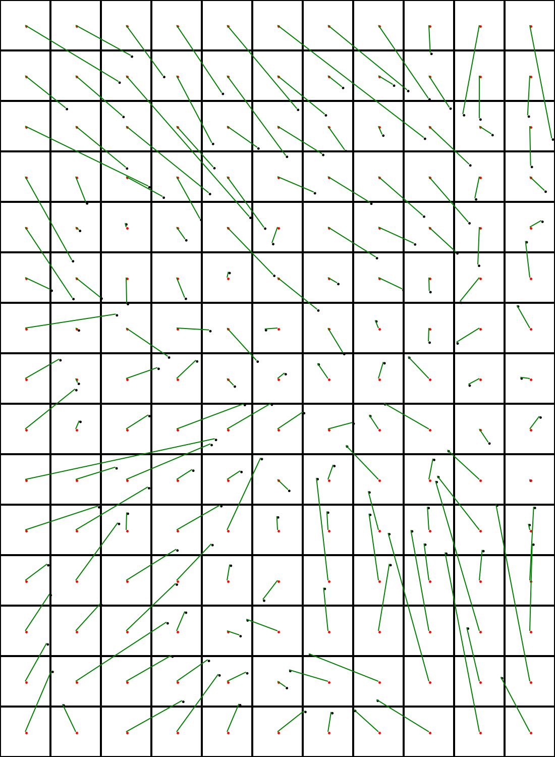
Each piece consists of 165 squares and each square represents a single small area (SA) from the Dublin region. Small areas are statistical borders that were organised based on the idea that each small area has an average household number of 65-90. They have a similar population but vary a lot in size.
There are approximately 5000 small areas in the Dublin region and around 18000 in the country. In this exhibition 12 different visual outputs are exhibited from different parts of the Dublin greater area.
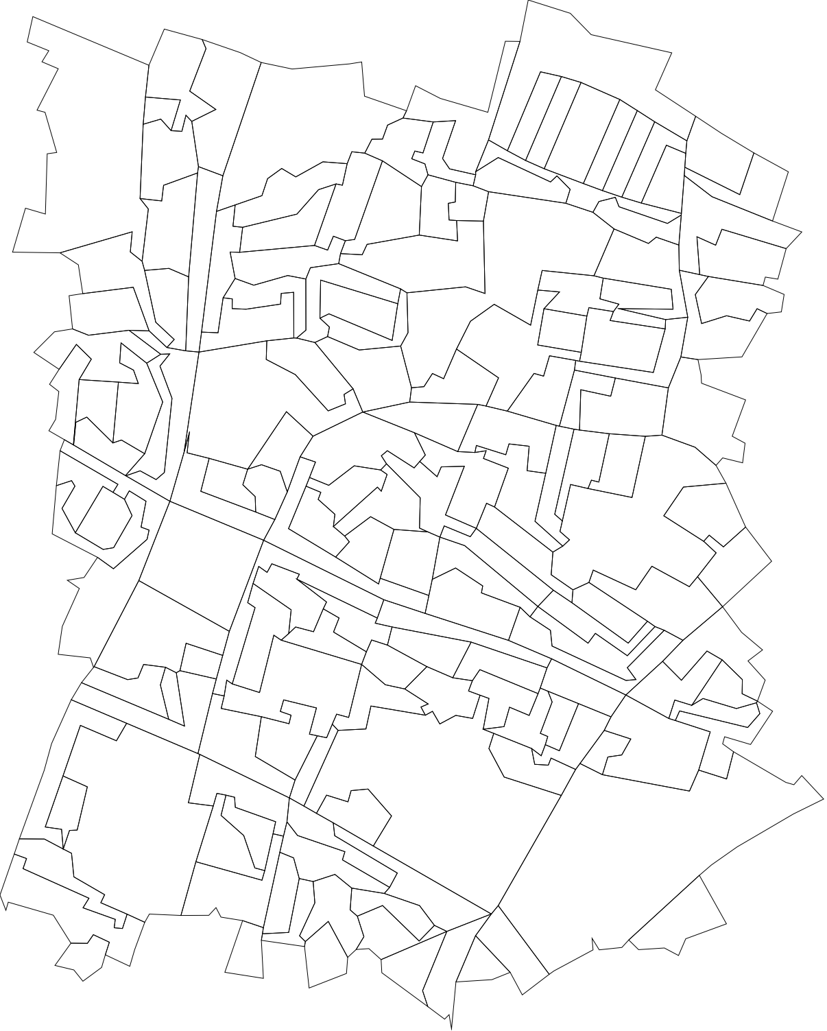
The small areas are visualised as a grid of squares instead of their spatial forms to counteract the effect of large areas visually dominating smaller ones. The grid layout maintains the spatial relationship between the areas as closely as possible so spatial patterns are still visible.
This translation from spatial to grid form is achieved using the Kuhn-Munkres algorithm which optimises the assignment of small areas to the grid cells so that the total distance of all movements is minimal. Irregular-shaped SAs are transformed into a same-sized regular grid of squares, mostly maintaining their spatial layout.
In this project two variables are used to explore the social dynamics:
- Age component - 40 is taken as the barrier (closest to the median age). The number of people below and over this age is calculated for each small area.
- Education component - Low (no education, primary, secondary, technical qualification) and High (higher certificate, bachelor, postgraduate, PhD). The total population for each category is calculated.
The proportions of each of these categories are then used for the visual representations.
Young vs. mature; low vs. high education; and if they are equal or almost equal.
As a data enthusiast, whether it is varying characteristics or existing similarities within the social structure, it is an exciting output to share. I hope you, as an audience, find it interesting, too.